

Do you find yourself apologizing to customers who were frustrated with the information available about your business online?
The internet is a chief source of data and information for your clients these days, and when what they seek is hidden or tucked away someplace inaccessible, you’re hindering, not helping, the business.
If you need a website revamp, you’ve come to the right place. Here are the best aspects of a minimalist website design to make your site look more modern.
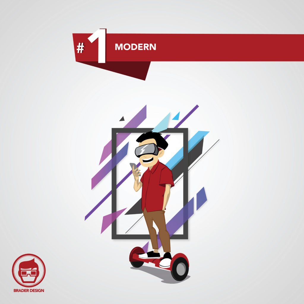
1. Modern
The more modern your website looks, the more people will take you seriously. They’ll respect your attention to detail and updated feel, and those impressions will translate to how they view your business, not only your website.
An outdated page gives the wrong impression. It’s like a dowdy suit at a networking event. You may be clean and friendly, but if your clothes don’t fit right or are too out of date, you still won’t make a professional connection.
Give your website the new suit it deserves, and refresh the design to something more modern. You’ll see business growth and development as people interact with the new layout.
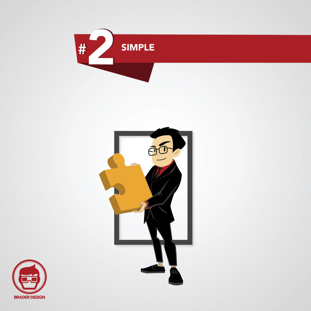
2. Simple
The less busy a website is, the easier your potential clients and customers can find the information they need. The more time they have to spend clicking around to find your hours, services, or pricing, the more frustrated they become.
So few people spend time having phone conversations, that everything needs to be easy to access on your website. Avoid losing customers because of a cumbersome website, and give them the exact info and help they want, in a fast and efficient package.
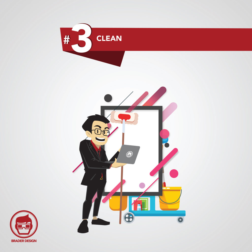
3. Clean
Studies show that clutter stresses people out. When you employ a clean design for your website, you’ll keep away the overwhelming feeling they experience on other websites. Cut their anxiety and help them feel like they can have what they want, instead of the helpless feeling clutter contributes to.
When buttons are organized and located in intuitive places, people will be able to find what they want on the first try. Use labels that make sense and don’t mislead.
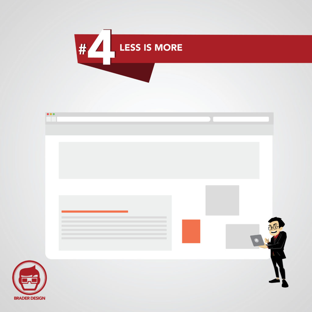
4. Less is More
You want a good color scheme that’s professional but not distracting. Basic lines and predictable but interesting visual cues work best. Use these to your advantage and combine them with your content and calls-to-action to get the most response from your website visitors.
Make sure to include lots of negative space, or white space. This helps the site look cleaner and organized, and it helps guide the reader’s eyes as they skim over the page. Eliminate sections that aren’t as useful so that your site can focus on the basic information people need.
The Best Minimalist Website Design
Finding the best minimalist website design will streamline the way your customers interact with your business online and help them find the most helpful information without frustration, and boost your reputation.
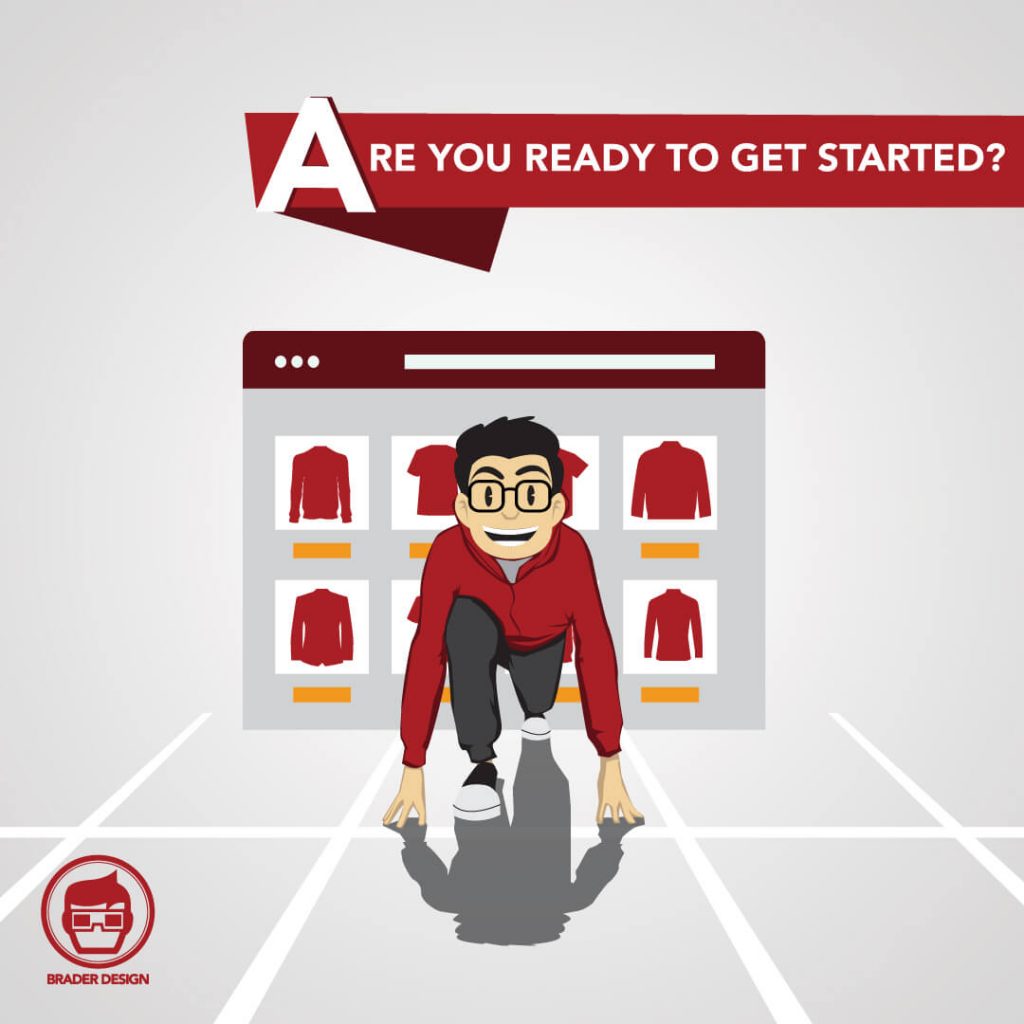
Not sure you’re up to the task of a complete redesign? Let us help you grow your business.
Hire us today to design your professionally customized website.
.
